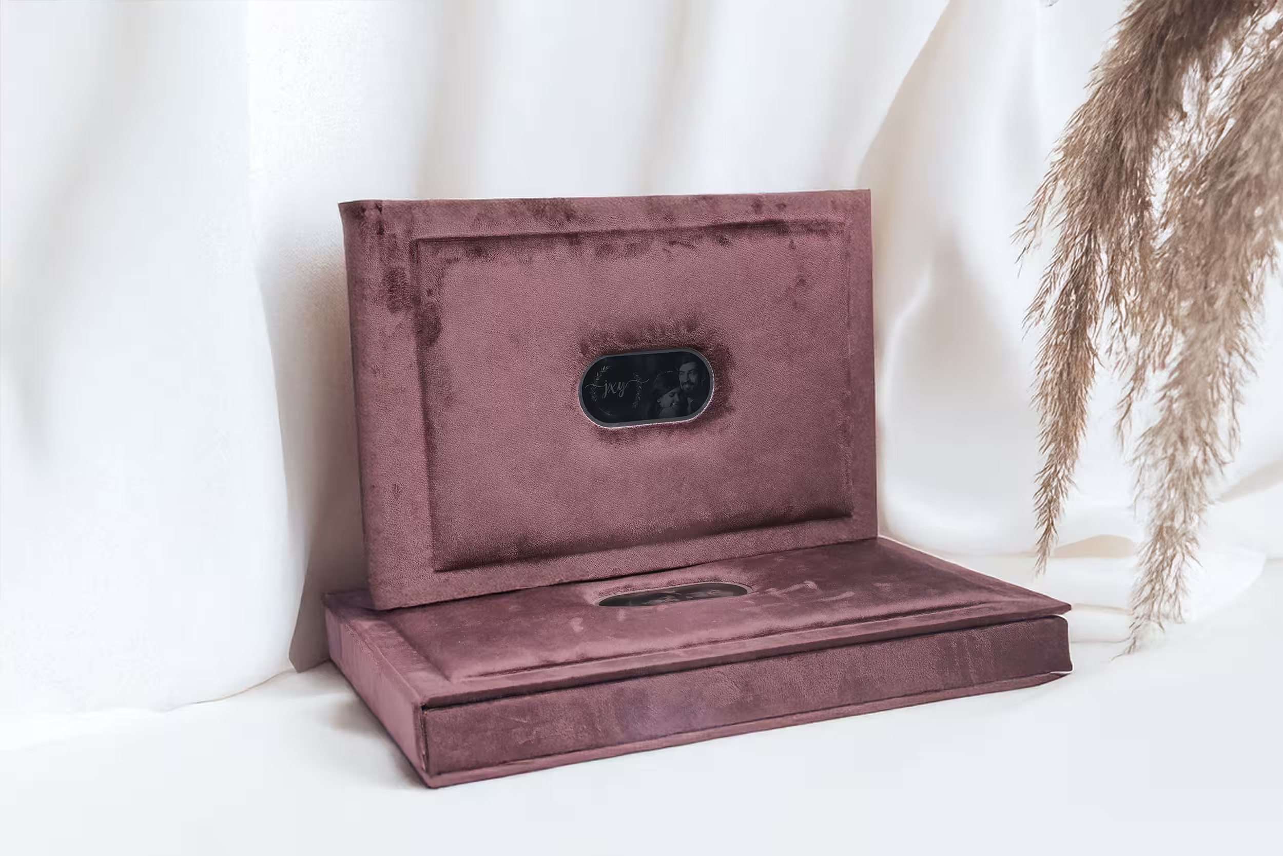
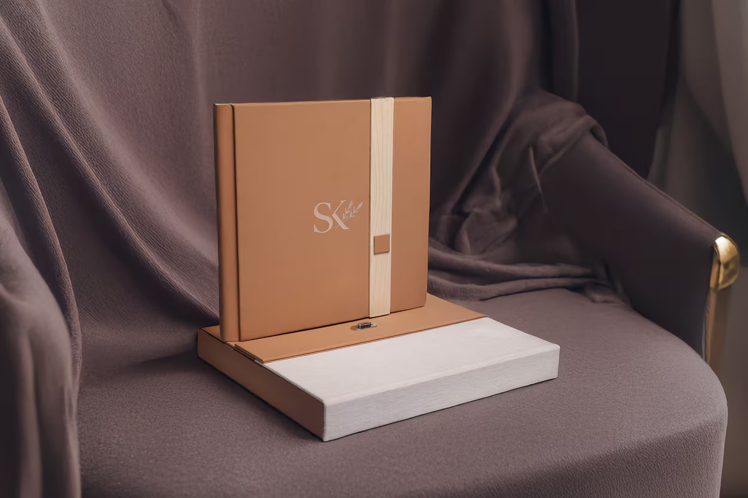
Every few months a photographer sends us the same brief in different words. The files are ready, the design is signed off, and now they want the album to feel expensive. Not look expensive in a listing photo. Feel expensive in the hands of a client sitting on a sofa at eight in the evening, opening it for the first time.
That feeling is not a mystery and it is not luck. It is the sum of three decisions that get made long before anything is printed: what paper the images land on, how the spine is built, and what the surface does when a thumb runs across it. Get those three right and even a modest set of photographs reads as an heirloom. Get them wrong and a brilliant wedding shoot ends up in a book that creaks, curls and gets shelved.
We build several hundred albums a month, and we see the same avoidable mistakes on repeat. So here is the whole anatomy, laid out plainly.
It Starts With the Paper
Paper is where photographers under-think and over-spend at the same time. The conversation almost always begins with weight. How many GSM? Most professional album stock sits somewhere between 200 and 350 GSM before mounting, and the honest truth is that within that band, weight tells you very little about how good the album will be. It tells you how stiff the page is. That is all.
What actually changes the photograph is the surface. A coated paper holds ink on top of a sealed layer, so the dot stays sharp and the black stays deep. Uncoated and textured papers let the ink sink slightly into the fibre, which softens the edge of every detail and lifts the black point. In plain terms: a coated sheet gives you contrast and punch, an uncoated sheet gives you air and calm. Neither is better. A high-key baby shoot in soft window light can look genuinely beautiful on a lightly textured uncoated stock, and completely flat on a glossy one. A dark, dramatic reception set with a lot of shadow detail will fall apart on that same textured sheet, because the deepest blacks will land at a muddy charcoal instead of true black.
Skin tone is where this gets expensive to learn the hard way. Warmer, slightly cream papers flatter Indian skin tones and take the clinical edge off studio portraits. Bright optical-white papers make whites look whiter and skin look cooler, sometimes unpleasantly so. If your palette leans warm and golden, a bright white base will fight you on every spread.
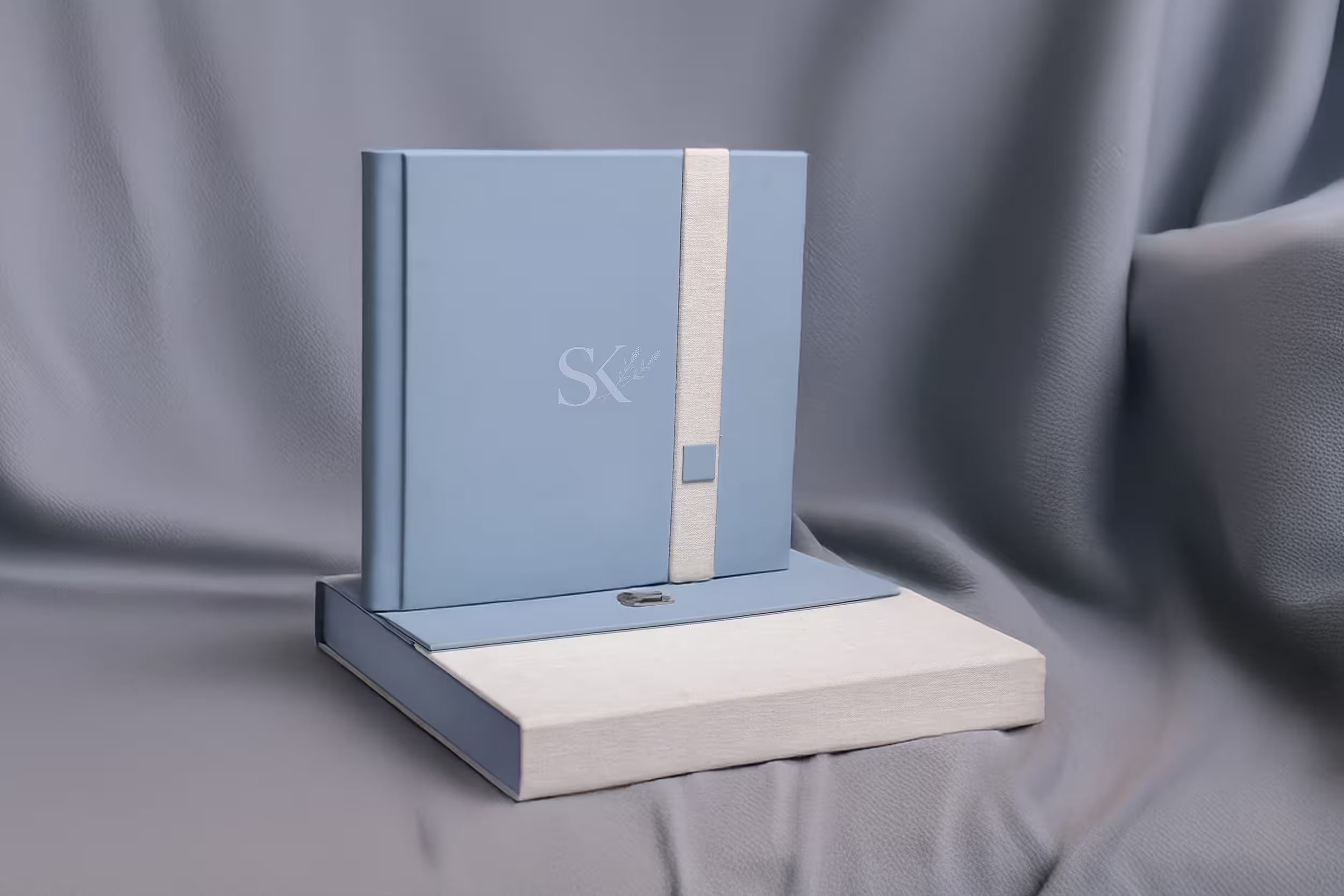
And heavier is not automatically better. A 350 GSM page mounted onto a rigid board gives you a thick, satisfying leaf, but it also gives you a thicker book. Thirty spreads of very heavy stock produce an album that will not sit flat unless the spine is engineered for it, and one that costs meaningfully more to ship. Weight should be chosen to match the binding, not chosen first and defended later.
The Spine Decides Everything
If we could get every photographer to care about exactly one thing on this list, it would be this one. The binding is the difference between a book that opens and a book that surrenders.
A perfect-bound album, the kind where pages are glued at the spine like a paperback, will never lie flat. Physics will not allow it. The client holds it open with a hand, the page curves away into the gutter, and about fifteen percent of every spread disappears into the fold. If you have placed a bride's face anywhere near the centre of a double-page spread, you have just lost her face. Perfect binding has its place in soft-cover proof books and mailers. It has no place in a premium album.
A lay-flat album is built so that the two halves of a spread meet at a hinge rather than a fold. The page is mounted to a core, the core is hinged at the spine, and the book opens to a true 180 degrees and stays there. Nothing is lost at the centre. A landscape image can run edge to edge across 24 inches without a break, which is the entire reason panoramic spreads exist.
A spread that breaks at the gutter is not a design choice. It is a manufacturing failure that the client will notice every single time they open the book.
Albums By ZG — Bindery Notes
The variations matter too. A hinged or butterfly construction adds a narrow flexible strip right at the join, so the panorama crosses the centre with almost no visible interruption at all. It is the closest thing we have to a seamless spread, and it is what we recommend the moment a photographer says the words "cinematic" or "wide". The trade-off is that hinged pages are slightly thinner at the join than a solid mounted leaf, so they need a well-chosen paper to avoid feeling flimsy. Which brings us, as always, back to paper.
The centre-line test
Before you send a design to print, draw a vertical line down the middle of every spread. Anything critical sitting on that line — a face, a hand, a text overlay, the couple's joined hands — is at risk on any binding that is not true lay-flat. If your design cannot survive the line, either move the subject or change the binding. Do not hope.
Finish Is What the Hands Remember
Here is the uncomfortable thing about handover. The client will look at the cover for about two seconds before they touch it. The touching is what they remember. Nobody ever told a friend about the GSM. They tell them the album felt heavy and soft, and they have no vocabulary beyond that. Finish is where you buy that sentence.
Lamination, and what each one costs you
The lamination on the printed page changes both how the image reads and how the album ages.
- Matte — kills reflections completely, so the album can be viewed under any light without the viewer having to tilt it. Deep blacks lose a little density. It shows fingerprints least, which matters more than photographers expect.
- Lustre or silk — the compromise almost everyone should be choosing. Holds contrast close to gloss, controls reflection close to matte, and hides handling marks well. If a client cannot articulate what they want, this is the safe answer.
- Gloss — maximum punch, maximum saturation, deepest blacks. Also maximum glare and a fingerprint magnet. Beautiful in a controlled viewing, tiring on a coffee table.
The cover is a separate decision from the pages, and it should be. Foil stamping gives you a crisp metallic line that catches light as the book is turned, and it works best when the design is restrained: a monogram, a date, two names. Debossing pushes the design into the material and creates shadow rather than shine, which reads quieter and more architectural. Both are ruined by trying to say too much. A cover with a monogram, a date, a venue and a quote on it does not look premium. It looks like a certificate.
Edge treatments are the detail nobody asks for and everyone notices. A gilt or painted page edge turns the closed album into an object. It is visible on a shelf, in a delivery photo, in the client's hands before a single page is open. It is one of the cheapest ways to raise the perceived value of a book, and it is criminally underused.
How the Three Choices Interact
Photographers tend to pick these one at a time, from a menu, as if they were independent. They are not. Some combinations amplify each other and some quietly cancel each other out.
Combinations that work. A warm, lightly textured uncoated stock with a matte lamination and a suede or linen cover produces a soft, editorial book that suits candid, natural-light work. Everything about it is quiet, and because everything is quiet, it reads as considered. At the other end: a smooth coated stock, lustre lamination, true lay-flat binding and a leather cover with a small foil monogram is the classic luxury wedding album, and it is classic because every element supports the same claim.
Combinations that fight. A heavily textured paper under a gloss lamination is the most common mistake we see. The gloss sits on top of the texture and produces an uneven, slightly plastic sheen that makes the paper look cheap rather than tactile. You have paid for texture and then buried it. Equally: a dark, moody set of images printed on a soft uncoated sheet will look underwhelming no matter how good the photography is, because the paper physically cannot hold the black. And a thick, luxurious 350 GSM page in a perfect-bound book is a genuine waste of money, because the stiffness you paid for is exactly what stops it opening.
The rule underneath all of this is simple. Decide what the album is trying to say first, then let all three choices say the same thing. An album that is trying to be two things at once ends up being neither.
A Simple Spec To Start From
If you are building your studio's default album and you want a baseline that will hold up across most weddings, most clients and most lighting conditions, start here and deviate on purpose rather than by accident.
- Paper: 250 to 300 GSM coated stock, slightly warm white base. Enough weight to feel substantial, enough coating to hold true blacks.
- Lamination: Lustre. It survives coffee tables, mixed lighting and fingerprints better than either extreme.
- Binding: True lay-flat, hinged if the design leans on panoramic spreads. Non-negotiable at premium price points.
- Cover: Full-grain leather or a quality suede, with a single foil or deboss element. One line of type, not four.
- Edges: Painted or gilt in a tone that echoes the cover foil.
- Size: 12 x 15 inches for the primary album. Large enough for a face to carry a full page, small enough to hold comfortably.
- Spreads: 30 to 40. Past that, spreads stop being memories and start being filler.
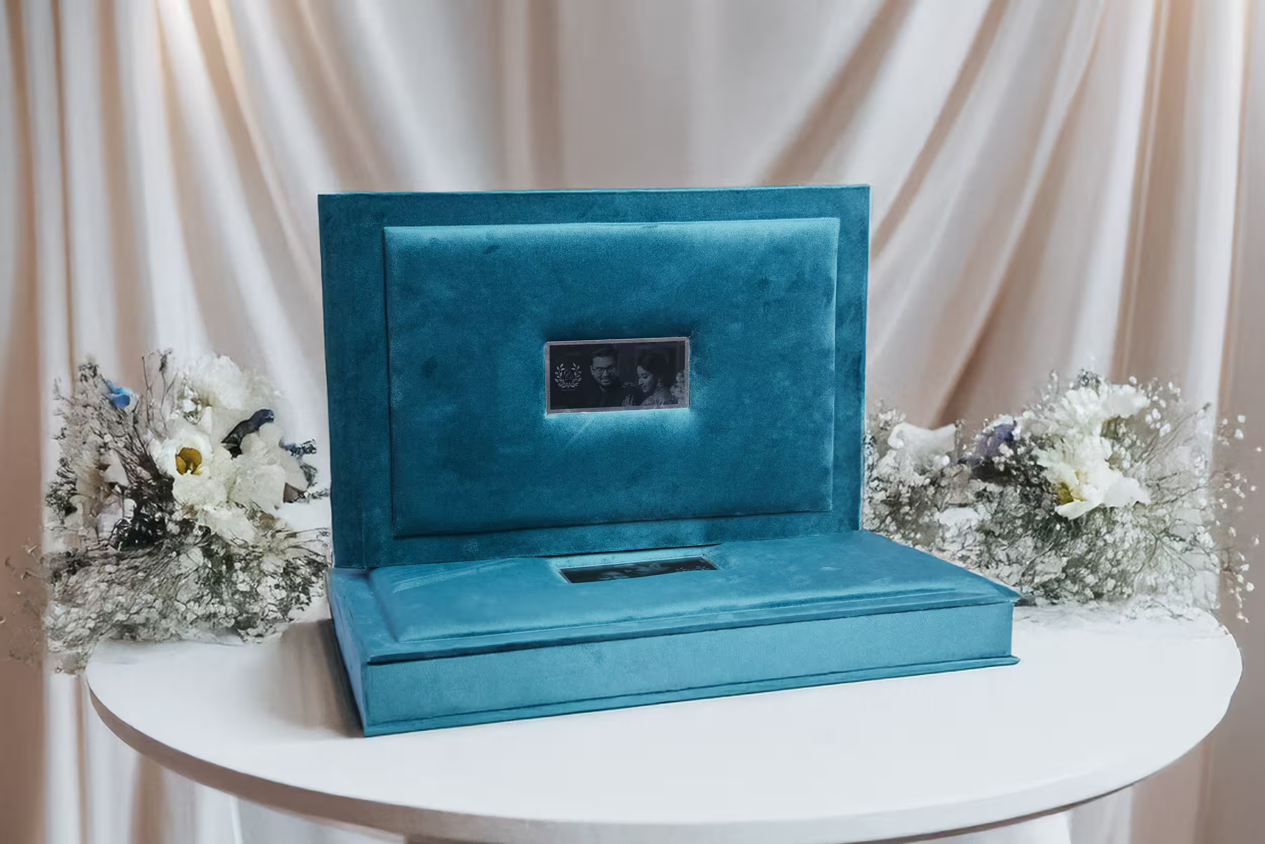
- Presentation: A rigid box lined in the same material family as the cover. The box is the first thing they see.
This spec is not the most expensive album we make. It is the one we would happily put our name on for a client we had never met, and that is a more useful benchmark. From here, change one variable at a time and learn what it does to the finished book. Change three at once and you will never know which one worked.
The albums that people keep are not the ones with the most features. They are the ones where paper, spine and finish were chosen by someone who understood that they are one decision wearing three costumes.