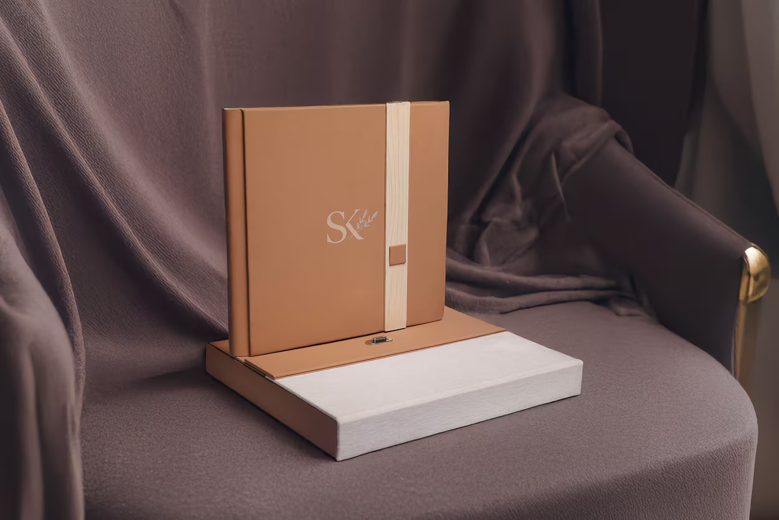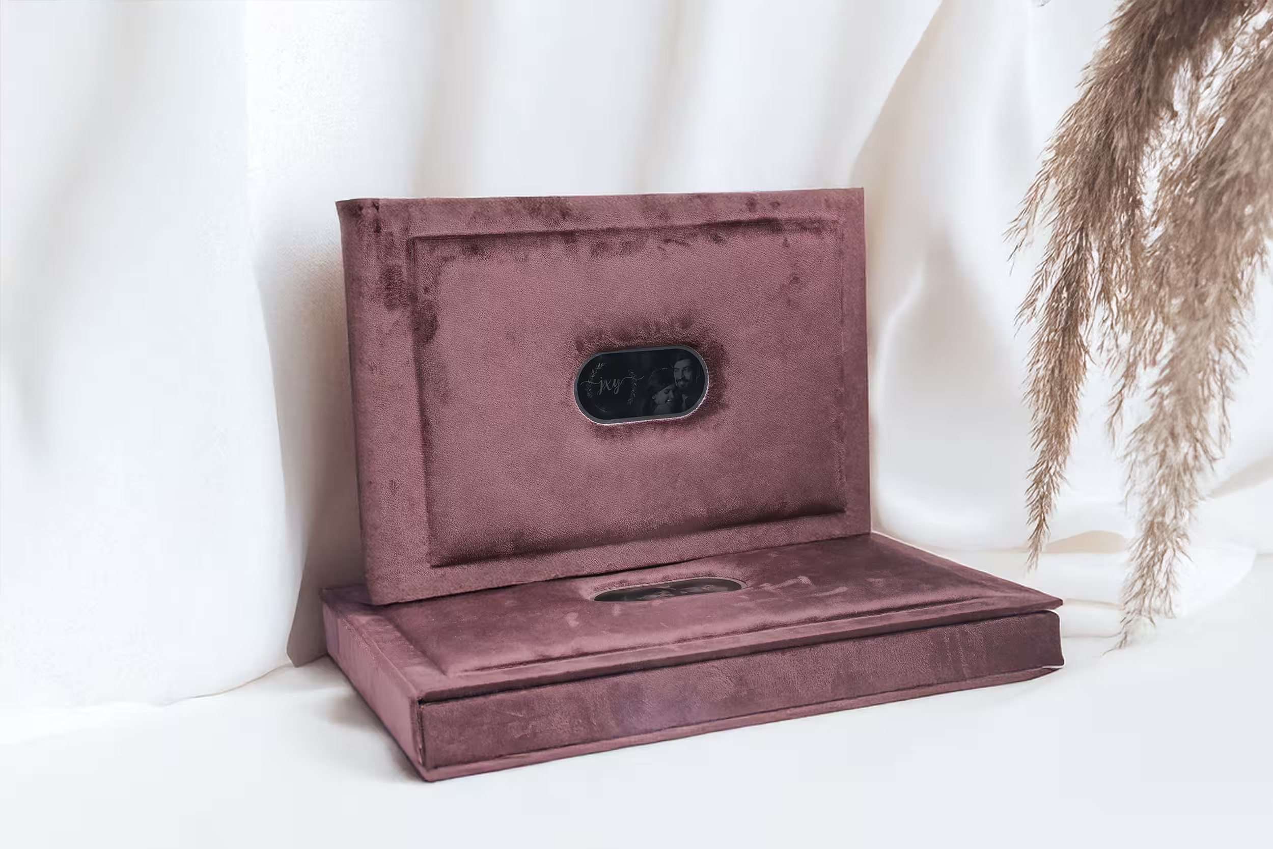
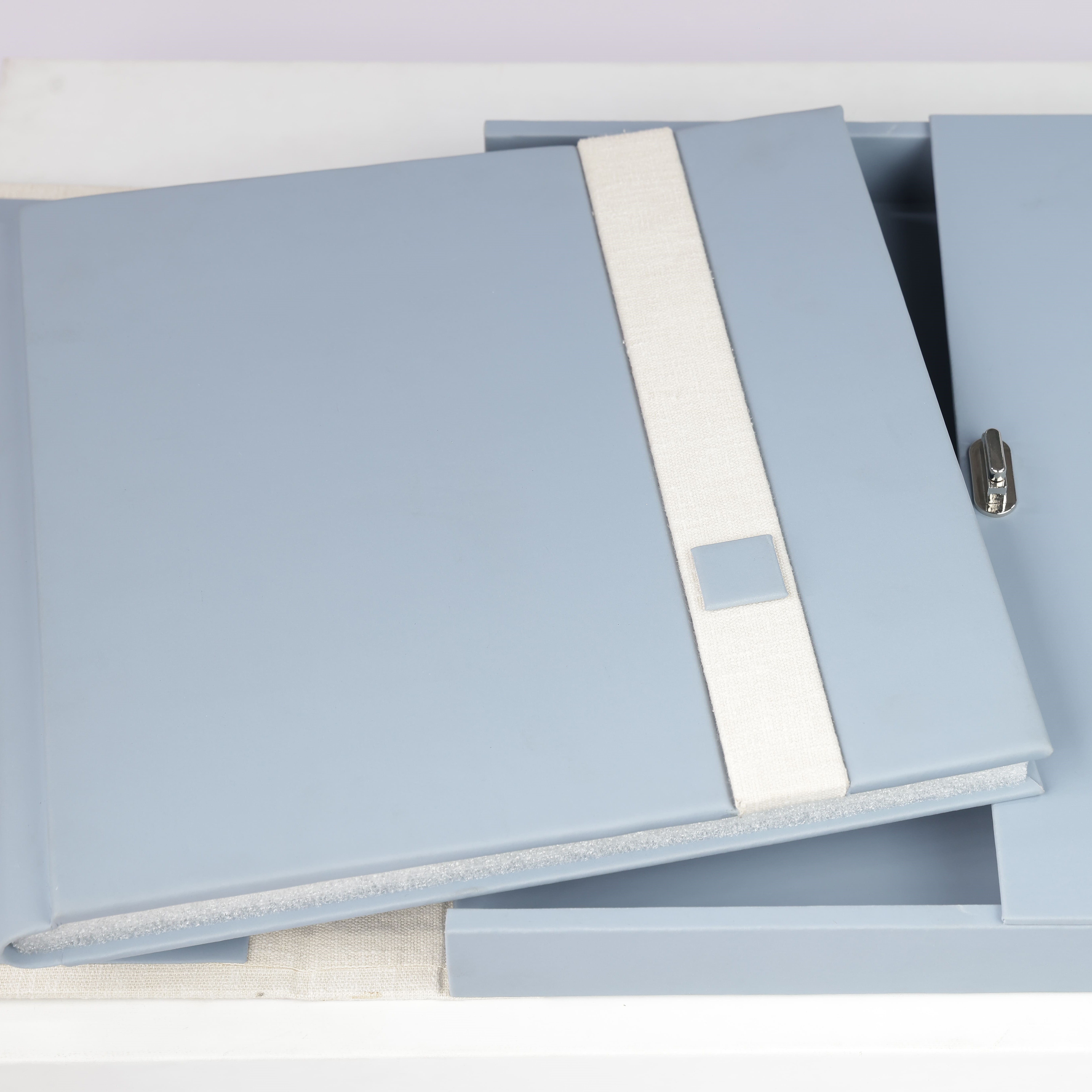
A wedding client tells you exactly what they want. They send you references, they argue about the cover colour, they cry at the reveal. A corporate client sends you a two-line email that says the company is turning twenty-five and they would like "something premium" for the board and a few key partners. Then they go quiet for three weeks and come back asking for a quote.
That gap — between a vague adjective and a physical object that has to survive a boardroom — is where most corporate album projects go wrong. The studio guesses. The client is politely disappointed. The books end up in a cupboard behind the coffee machine. Nobody says anything, and the studio never gets asked again.
It does not have to go that way. Corporate work is some of the most repeatable, best-paid work a studio can hold, because companies keep having milestones and they almost never have an internal answer for how to mark them. But you have to run the brief properly. This is how we do it from the bindery side, and what we wish more studios asked us before the first proof.
Decode the Brief
"Premium" is not a specification. It is a feeling the client has been asked to produce by someone above them, and they are passing that anxiety on to you. Your job in the first conversation is to convert it into decisions you can actually cost and build. Three questions do most of that work.
Who receives it? A book for nine board members is a fundamentally different object from a book for two hundred employees. The first can be leather-bound, numbered and boxed. The second has to survive being handed out at a town hall, carried home on a train, and left on a desk. Ask for the recipient list before you ask for anything else — the number alone will tell you more about the right material than an hour of mood-boarding.
Where will it sit? A book that lives on a reception coffee table is handled by strangers every day and should be built to take fingerprints without showing them. A book that goes into a founder's home library gets opened twice a year and can afford a finish that marks. A book destined for a display case beside a trophy is being looked at, not read, and the spine and cover carry the entire job.
What must it say? Not the copy — the message. "We have been here twenty-five years and we are not going anywhere" produces a different book from "we just raised a Series B and we are the future." The first wants weight, restraint, and archival stock. The second wants confidence, air, and a cleaner grid. Get the client to say the sentence out loud. Write it at the top of the spec sheet and design against it.
A corporate album is not a marketing asset with a hard cover. It is an artefact the company will be judged by ten years after the person who commissioned it has left.
The ZG Bindery Desk
The Occasions That Justify a Book
Not every corporate event deserves a bound album, and it does the client no favours to pretend otherwise. A book is a permanence claim. It says: this happened, and it mattered enough to become an object. If the occasion cannot carry that claim, you are building an expensive brochure and everyone will know.
The occasions that genuinely earn a book share one trait — they will still be referenced years later, by people who were not in the room.
- Milestone anniversaries. Twenty-five, fifty, a hundred years. The strongest brief in the category, because the client already understands they are producing something for the archive, not the quarter.
- Factory, campus and office openings. A building is the most photographable thing a company ever does. Construction progress, the first shift, the ribbon — this is a narrative with a beginning and an end, which is exactly what a book needs.
- IPO and funding milestones. Listing day, the bell, the founding team on the floor. Short, intense, heavily photographed, and permanently significant to the people in it. These books get kept.
- Founder and long-service retirements. The most emotional corporate book you will ever make, and the one where restraint matters most. It is a personal gift wearing a company's clothes.
- Annual reviews for the people who built the year. Not the statutory report — a photographic year in the life, given to the senior team. A genuinely good use of a book, and an annual repeat order.
- VIP and partner gifting. Given at the end of a long relationship or the start of a big one. Small runs, high spec, presentation box mandatory.
If a client comes to you with a product launch or a trade show and asks for an album, ask them honestly whether anyone will open it in five years. Sometimes the answer is yes. Often the honest answer is that they need a beautiful print run of something else, and telling them so is how you become the studio they call for the twenty-fifth anniversary.

Restraint Reads as Expensive
The instinct on corporate work is to prove value by adding. Gold foil on the cover, the logo repeated on the spine, the tagline debossed under it, a metallic edge, a full-colour endpaper with the brand pattern. Every one of those decisions is defensible on its own. Together they produce a book that looks like a conference giveaway.
Expensive objects are quiet. Walk into any hotel that charges properly and look at what is on the coffee table: a heavy book with a plain cover, a small mark, and nothing else. The restraint is the signal. It says the object does not need to argue for itself. Your corporate cover should aim for the same confidence — one mark, one material, one decision the eye can rest on.
Blind deboss over loud foil
Foil is the default request and it is usually the wrong one. Bright gold on a dark cover photographs beautifully and ages like a wedding invitation. A blind deboss — the logo pressed into the material with no ink, no foil, no colour — does something better. It catches light only when the book moves. The recipient has to tilt it to read it, which means they pick it up, which is the entire objective.
Where a client insists on foil, argue them down to a single small mark in a matte or brushed finish rather than a mirror one. Matte foil on a textured cover reads as considered. Mirror foil on a smooth cover reads as a certificate.
One brand colour, and generous margins
Most brand systems have a primary and four or five supporting colours. A corporate album needs one of them — usually as an accent on a divider, an endpaper, or the head and tail bands — and the rest of the book in neutrals. Introduce a second brand colour and the interior starts to look like a slide deck.
The same logic governs white space. A photograph with air around it reads as a photograph worth looking at. The same photograph bled to the edge, on a spread with three others and a caption block, reads as content. Corporate clients will push for more images per spread because there are more stakeholders to please. Hold the line: fewer, larger, with margins. A book that fits everyone's photo in is a book nobody looks at twice.
The drawer test
Before you sign off any corporate cover, ask one question: if this book were sitting face-up on a boardroom table with no context, would a visitor pick it up? If the answer is no, you have designed a report. Strip a decision out and ask again.
Brand Guidelines Meet Bindery Reality
Somewhere in every corporate project a PDF arrives called Brand Guidelines. It is authoritative, it was written by an agency, and it was written entirely for screens and offset print. Almost none of it survives contact with a bindery unmodified, and the earlier you say so, the less painful the conversation is.
Pantone is a promise made on coated paper. The brand's spot colour was specified against a Pantone chip. Your album interior is printed on uncoated or lightly coated photographic stock, in CMYK, on a press that is calibrated for skin tones. A Pantone will not reproduce exactly, and any attempt to force it will pull every photograph on the spread with it. The correct move is to agree the closest achievable CMYK build in advance, print a physical patch, and get it signed off as the project's colour — before anyone sees a proof.
Screen-blue is the usual casualty. The vivid, slightly electric blue that so many brands use lives comfortably inside a monitor's gamut and outside a printer's. What comes back is duller and slightly more purple, and the client's first reaction is that you got it wrong. You did not — the colour was never printable. Show them the patch early, explain it once, and it becomes a known constraint instead of a failure.
Logos do not sit politely on texture. A logo lockup designed for a white screen behaves differently pressed into suede, jute or a coarse grain. Fine serifs disappear. Thin rules fill in. Tight counters close up. As a working rule, any line in an embossed or debossed mark wants to be at least half a millimetre wide, and anything finer needs to be redrawn for the bindery or dropped. Bring this up at the guidelines stage — brand teams are usually far more flexible about a bespoke bindery version of the mark than they are about a bad one.

Editions, Numbering and Distribution
The single cheapest way to make a corporate book feel valuable is to make it finite. Print a hundred and number them. A small foil or letterpress numeral on the first endpaper — No. 07 of 100 — changes how the object is treated, permanently. Nobody throws away number seven of a hundred. It costs you very little and it does more for perceived value than any upgrade to the cover.
Numbering also solves the political problem quietly sitting underneath every corporate gifting project: who gets one. A limited edition makes scarcity a design decision rather than a budget cut. It gives the client a clean line to hold internally, which they will be grateful for even if they never tell you so.
Distribution is the part studios forget to quote for. If nine books are going to nine board members, they are being couriered — individually, often internationally. That means a presentation box that survives a courier, not one that photographs well on a table. Rigid, snug, with the book restrained so it cannot move in transit. And keep the sizes matched across a board set: a director whose book is a centimetre smaller than the chairman's will notice, and you will hear about it.
A Spec That Works for Most Corporate Books
Every project deserves its own thinking, but when a client wants a starting point on a call, this is the one we give. It is unglamorous, it is safe, and it has never come back disappointing anyone.
- Size: 12x12 in square, or 12x9 in landscape. Square reads as a considered object; landscape suits architecture and factory work.
- Cover: Full-grain leather or a fine-grain textured rexine in charcoal, deep navy, or a warm neutral. No pattern, no bleed image.
- Cover mark: A single blind deboss of the logo, centred or lower-third. Nothing on the back cover except, at most, a small blind mark.
- Spine: Company name or year range only, in a matte foil or blind. Not the logo and the name and the year.
- Interior stock: 250–300 gsm photographic paper, matte or satin. Never gloss for corporate — it fingerprints, and it cheapens architecture.
- Binding: Lay-flat, so a spread across the gutter actually works. This is non-negotiable for factory and building photography.
- Extent: 30 to 40 spreads. Long enough to be an object, short enough that every image earns its place.
- Edition: Limited run, hand-numbered on the front endpaper.
- Presentation: Rigid box, matched to the cover material, with a snug interior and a courier-safe fit.
Build that book, hand it to a client who asked for "something premium," and watch what they do with their hands. They will turn it over. They will run a thumb across the deboss. They will open it flat. That reaction is the whole brief, decoded — and it is why the next milestone comes back to you without a tender.